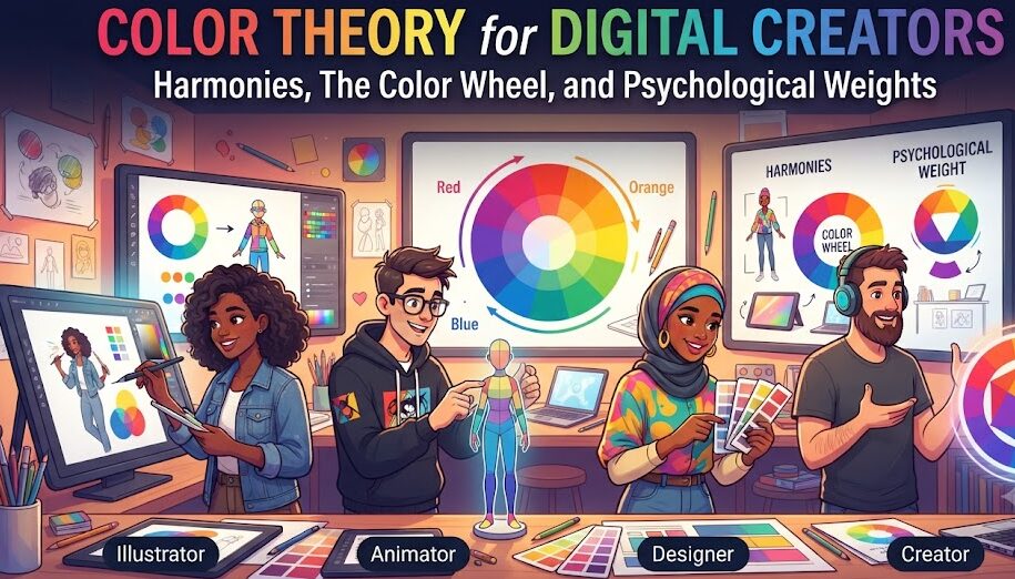
Color Theory for Digital Creators: Harmonies, The Color Wheel, and Psychological Weights
For centuries, classical color theory was taught through the physical mixing of oil paints, gouache pigments, and physical print inks on white canvas. However, in the modern digital era—where visuals are rendered across emissive OLED screens, responsive browser engines, and neural network generative models—traditional subtractive pigment logic is insufficient. Digital creators, product designers, and AI artists require a deep, systematic understanding of how light, digital color spaces, and human neurological processing interact.
Color is the fastest communicative medium in human experience. Before a visitor reads a single word on a website or consciously examines an artwork’s composition, their visual cortex has already cataloged emotional tone, established spatial hierarchy, and determined brand authority. In this comprehensive masterclass, we explore the physics of digital color wheels, examine the mathematical construction of classical harmonies, dissect the concept of optical visual weight, and bridge modern color psychology with practical UI and generative design rules.
1. Additive vs Subtractive Color: Understanding the Emissive Canvas
To master color in modern digital media, creators must clearly distinguish between physical print chemistry and emissive digital displays:
1. The Subtractive Model (RYB / CMYK)
Physical surfaces (paper, fabric, canvas) operate on subtractive color. White paper reflects all ambient light waves. When physical pigments are layered onto the paper, they absorb (subtract) specific wavelengths while reflecting the remainder back into your eyes. Combining all primary subtractive pigments theoretically absorbs all light, resulting in muddy black.
2. The Additive Model (RGB / Display Screens)
Digital displays (smartphones, monitors, VR headsets) operate on additive color. The screen begins as a dark void of unlit pixels. As electrical currents stimulate red, green, and blue sub-pixels, wavelengths are emitted outward directly toward human retinas. Combining all three primary additive channels at full intensity results in pure white light.
Because digital creators work with pure emitted light rather than physical matter, color harmony rules must be calculated according to modern digital color science rather than 18th-century pigment wheels.
2. The Mathematical Anatomy of the Digital Color Wheel
The standard digital color wheel spans a 360-degree circle where hue ($H$) represents the angular position on the spectrum. By applying precise geometric divisions across this 360° circle, designers generate mathematically balanced color harmonies:
The 6 Classic Mathematical Harmonies
| Harmony Archetype | Angular Formula | Visual Characteristics | Best Applied Context |
|---|---|---|---|
| Monochromatic | Single Hue (0°), variable L/C | Cohesive, serene, minimal risk of clashing | Editorial layouts, focused single-task software |
| Analogous | Base Hue ± 30° to 45° | Natural flow, organic, low visual friction | Lifestyle blogs, wellness branding, environmental art |
| Complementary | Base Hue + 180° | Maximum chromatic contrast, high vibration | Primary CTA buttons, action badges, sports media |
| Split-Complementary | Base Hue + 150° and 210° | High contrast without the tension of direct opposites | Complex multi-category portals, mobile app kits |
| Triadic | Base Hue + 120° and 240° | Dynamic, vibrant, balanced energetic punch | Creative agencies, gaming platforms, youth branding |
| Tetradic (Square / Rect) | Two complementary pairs (90° / 60°) | Extremely rich, multi-layered visual variety | Data dashboards, rich illustrative game art |
3. Optical Weight: Why Colors Have Mass and Scale
One of the most overlooked concepts in digital graphic design is optical color weight. While two geometric boxes may measure exactly 200px by 200px in code, our brains do not assign them equal visual significance if their colors differ.
The 3 Factors That Determine Color Mass
- Luminance (Value): Darker colors appear heavier and more physically dense than light colors. A charcoal black button draws the eye faster and feels heavier than a pale sky blue container of equal physical dimensions.
- Chroma (Saturation): High-saturation hues vibrate actively on retinal cones, commanding immediate priority over desaturated, muted tones.
- Wavelength (Warm vs Cool): Long-wavelength colors (red, orange, yellow) optically advance forward toward the viewer, expanding their perceived area. Short-wavelength colors (cyan, blue, violet) physically recede into the canvas plane.
The 60-30-10 Spatial Balance Rule
To prevent heavy colors from overwhelming your interface, follow the architectural 60-30-10 distribution guideline:
- 60% Dominant Canvas Tone: Low-saturation, low-weight neutral surface (e.g., soft off-white, light gray, or deep obsidian slate) providing spatial resting ground.
- 30% Structural Secondary Tone: Structural components, sidebars, secondary buttons, and card backgrounds maintaining organization.
- 10% High-Mass Accent Tone: Reserved exclusively for focal points: conversion CTAs, active highlights, key metrics, and notification alerts.
4. Four Curated Digital Harmony Palettes (With Exact HEX Seeds)
Below are four production-ready color harmonies engineered for digital interfaces and digital artwork, complete with exact HEX codes and functional assignments.
Palette 1: Golden Hour Horizon (Analogous Harmony)
A soothing, organic progression spanning warm amber, sunset apricot, and rose terracotta.
| Role | Color Name | HEX Code | RGB Value |
|---|---|---|---|
| Primary Highlight | Sunlit Amber (45°) | #F59E0B | rgb(245, 158, 11) |
| Secondary Transition | Tangerine Horizon (25°) | #F97316 | rgb(249, 115, 22) |
| Focal Accent | Sunset Rose (350°) | #E11D48 | rgb(225, 29, 72) |
| Warm Canvas | Alabaster Buttercream | #FFFBEB | rgb(255, 251, 235) |
| Dark Anchor | Espresso Clay | #451A03 | rgb(69, 26, 3) |
Palette 2: Oceanic Spark (Complementary Harmony)
Classic complementary opposition: deep cobalt blue paired with vibrant electric coral.
| Role | Color Name | HEX Code | RGB Value |
|---|---|---|---|
| Brand Anchor | Deep Cobalt (220°) | #1D4ED8 | rgb(29, 78, 216) |
| Direct Opposite CTA | Electric Coral (40°) | #FF6B4A | rgb(255, 107, 74) |
| Supporting Sky | Soft Cerulean | #60A5FA | rgb(96, 165, 250) |
| Clean Base | Pure Ice Slate | #F8FAFC | rgb(248, 250, 252) |
| High Contrast Text | Midnight Slate | #0F172A | rgb(15, 23, 42) |
Palette 3: Prismatic Creative (Triadic Harmony)
High-energy triad balancing royal violet, turquoise teal, and golden marigold.
| Role | Color Name | HEX Code | RGB Value |
|---|---|---|---|
| Creative Primary | Imperial Violet (270°) | #7C3AED | rgb(124, 58, 237) |
| Equidistant 1 | Sea Teal (150°) | #0D9488 | rgb(13, 148, 136) |
| Equidistant 2 | Marigold Gold (30°) | #EAB308 | rgb(234, 179, 8) |
| Canvas Foundation | Chalk Porcelain | #FAFAF9 | rgb(250, 250, 249) |
| Typography Stone | Charcoal Granite | #1C1917 | rgb(28, 25, 23) |
Palette 4: Bio-Luminescence (Split-Complementary Harmony)
Engineered for dark gaming interfaces and generative sci-fi art: deep emerald paired with lilac and rose.
| Role | Color Name | HEX Code | RGB Value |
|---|---|---|---|
| Key Radiant Base | Bio Emerald (160°) | #10B981 | rgb(16, 185, 129) |
| Split Wing 1 | Neon Orchid (280°) | #A855F7 | rgb(168, 85, 247) |
| Split Wing 2 | Laser Rose (340°) | #F43F5E | rgb(244, 63, 94) |
| Elevated Surface | Dark Chassis Slate | #111827 | rgb(17, 24, 39) |
| Deep Void | Obsidian Core | #030712 | rgb(3, 7, 18) |
5. Color Psychology: Emotional Associations in Digital Experience
While personal and cultural backgrounds influence how people perceive colors, international digital interfaces have established clear psychological associations:
Digital Psychological Profiles
| Color Family | Dominant Psychological Response | Industry Alignment |
|---|---|---|
| Blue | Security, dependability, intellectual clarity, institutional trust. | Finance, Cloud Infrastructure, Corporate SaaS, Healthcare |
| Green | Vitality, wealth accumulation, natural balance, positive renewal. | Fintech, Sustainability, Environmental Platforms, Wellness |
| Purple | Creativity, technological sophistication, high imagination, luxury. | AI Platforms, Web3 Protocols, Creative Studios, Gaming |
| Red | Urgency, high kinetic passion, immediate physical alert, desire. | E-Commerce Sales Triggers, Food Delivery, Emergency Warnings |
| Amber / Orange | Warm optimism, energetic friendliness, accessibility, innovation. | Developer Tooling, Community Portals, Analytics Dashboards |
| Slate / Black | Sophistication, timeless minimalism, prestige, disciplined focus. | High-End Architecture, Luxury Fashion, Professional Hardware |
6. Practical Checklist for Applying Color Theory in Digital Projects
- Identify whether you are creating for additive light (screens) or subtractive matter (print) before choosing base color spaces.
- Use mathematical degree relationships on the color wheel (analogous, triadic, complementary) to prevent arbitrary chromatic clashes.
- Balance optical weights: match heavy, dark, saturated elements with expansive, low-saturation neutral canvases.
- Follow the 60-30-10 distribution rule to avoid visual overload.
- Verify that high-impact complementary colors are reserved for actionable user touchpoints, rather than static backgrounds.
By treating color theory as an exact discipline balancing optical physics, geometry, and cognitive psychology, digital creators can craft visual experiences that capture attention effortlessly, communicate intent instantly, and endure aesthetically across evolving platforms.